Total: €0,00
Taxes and shipping calculated at checkout


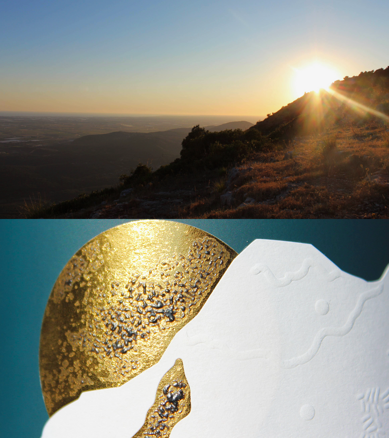
We wanted to transform our landscape into an essential graphic sign,
capable of describing the territory without illustrating it.


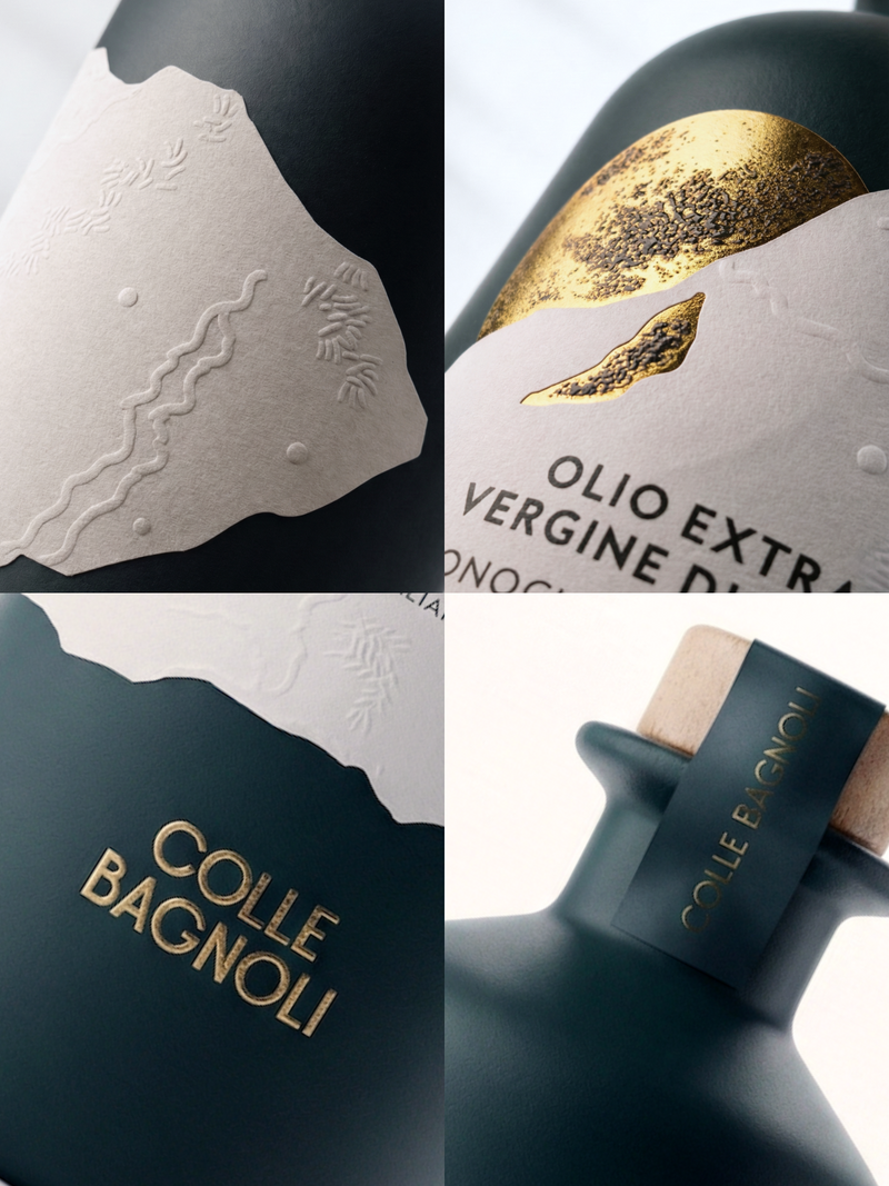
Its shape is inspired by those used by Ancient Pharmacies. Clean lines, PANTONE® painted glass, and precious finishes. Every detail of the bottle is designed to combine aesthetics, functionality, and respect for our family's olive oil-making tradition.


An elegant and textured gift box, made of blue cardboard with embossing and gold foil, interacts with light and material, recalling the Sonnino landscape and the sun that marks its rhythms.
Die-cut label that recalls the shapes of the Pontine Hills, made of Tintoretto Gesso Greasproof textured paper with embossing for a unique feel.
A gold- foil sun with a design that illuminates and captures the eye. The logo is pad-printed in gold directly onto the glass, like a tattoo, designed to last.
Wooden cap with dispenser and anti-refill, sealed thanks to a metal collar with a gold silk-screened logo.
Natural paper cardstock with a textured surface that feels great under your fingers. Not text, but silkscreen and gold foil decorations.
These are the traits that unite our vision: bottle and box in perfect harmony to best protect our most precious asset: oil.

Each bottle is a reflection of our vision: an oil that lingers in the memory even after the last drop.
The memory remains in the form.